


Customise data comparison chart style
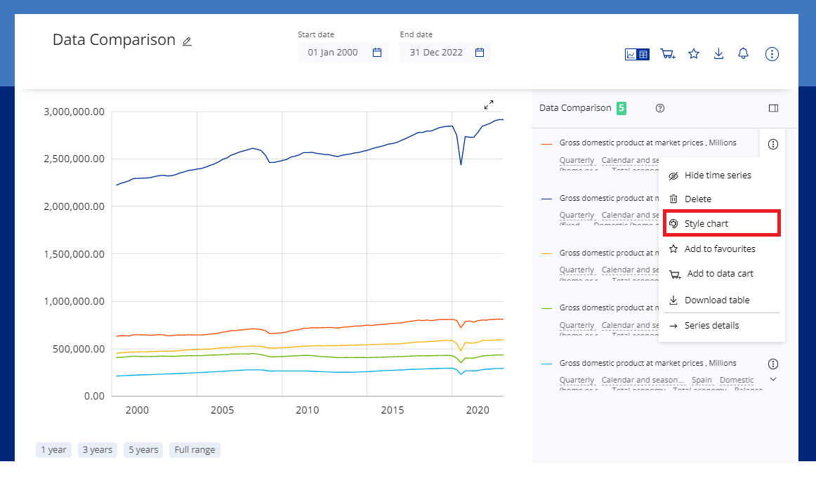
There are many ways you can customise your chart style directly in the time series page. You can open the style palette by clicking the three dots next to the time series and selecting style chart in the drop-down menu.
Style chart
You will now have the option to style the chart in the following ways:
- Chart style
- Colour
- Line weight
- Line style
- Y-axis position
- Show missing observations
Style chart pane
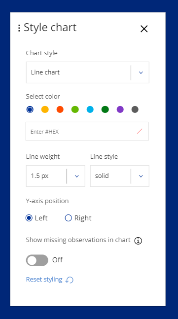
Chart style
You can opt to show your selected time series as either a line chart, a bar chart or an area chart. The chart area will automatically update once you click on your selected chart style.
Colour
You have two options when selecting a colour for your time series:
- Choose one of the eight pre-selected alternatives.
- Choose your own colour by inserting its HEX code.
Line weight and style
If you have opted for a line chart for your time series, you have the option to select the line weight and style.
Click on line weight and choose from several options for changing the pixel points of the trend in your chart.
You can also select the line style (solid, dashed, dotted, etc.) to provide a more distinctive difference between your chart’s time series.
Y-axis position
You can select whether to show the y-axis on the right or on the left.
Show missing observations
Missing observations are defined here as observations for which we do not have values. By default, breaks in the chart are not displayed for missing observations. Select Show missing observations to see the missing observations in the chart.